
Valentine Sale Landing Page Template: Guided Gifting That Lifted CVR Up to 40%
A teardown-style case study on curated gifting collections, “V-DAY SPECIAL” product cues, and AI-generated gift guides that shortened decision time.


Valentine’s sale traffic behaves like deadline traffic. People arrive with urgency, budget constraints, and low patience.
For Lifelong, the Valentine landing page introduced a guided gifting flow built around curated paths and decision support. During the window, CVR moved from a typical ~0.5% to ~0.7% on observed days, which works out to ~40% lift.
This case study breaks down the exact modules on the page and the logic behind them, so another D2C team can replicate the structure with their own catalog.
Live page: Lifelong Valentine’s Day
The buyer mindset you’re designing for
Valentine’s shoppers typically juggle four pressures at once:
a ticking clock (event date + shipping window)
a budget ceiling
fear of picking the wrong thing
low patience for discovery
A normal sale page asks shoppers to do heavy work: scan, compare, interpret discounts, open multiple PDPs, backtrack, repeat.
A Valentine landing page earns its keep when it reduces that work early.
About the brand
Lifelong Online Retail Pvt. Ltd. is a consumer durables brand across Home & Kitchen and Health & Fitness, spanning categories like sports & fitness, massagers & wellness, personal grooming, and home essentials.
Challenges
Multi-category catalog context: a single sale grid forces shoppers to self-navigate across fitness, grooming, wellness, and kitchen.
Deadline traffic: Valentine intent favors fast shortlisting and confident picks (high drop-off risk if discovery feels slow).
Sale comprehension: offer and urgency need to stay visible while the shopper compares products.
Gift uncertainty: Even with an offer, gift selection typically stalls when the shopper can’t decide what fits the recipient or occasion. The experience needs an “ideas layer” that behaves like a shortlist with rationale.
Solution
A gifting-led information architecture built on top of the sale
Helium structured the Valentine experience as a guided journey built from four merchandising layers: orientation → shortlist → continuity cues → decision support.
1) Campaign signal that stays present (so shoppers don’t lose context)
What we shipped:
A prominent Valentine sale announcement bar with countdown and offer (“UP TO 60% OFF + EXTRA 5% OFF”)
A dedicated Valentine’s Day page as the campaign hub
Why this matters:
Shoppers convert faster when they feel “I’m in the right place” early. Persistent campaign signaling reduces the mental back-and-forth that leads to tab-close behavior.
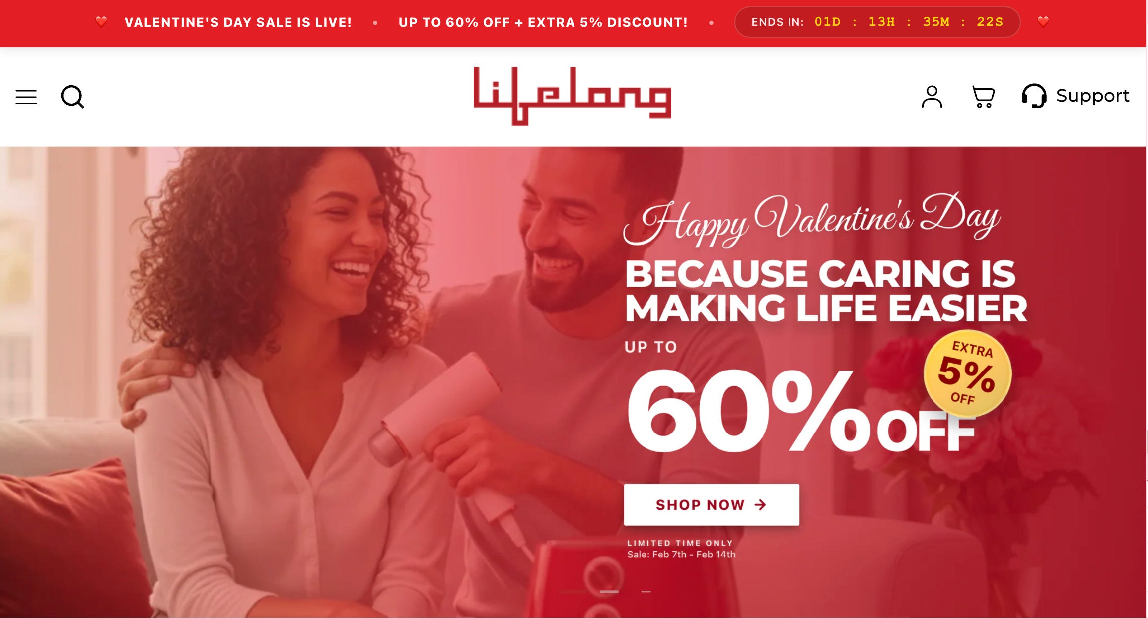
2) Orientation layer: persistent urgency + offer visibility
The live site carries the Valentine offer and countdown prominently, creating a consistent event context from first view through scroll.
What this enables: fewer “offer verification” loops and cleaner comparison behavior.
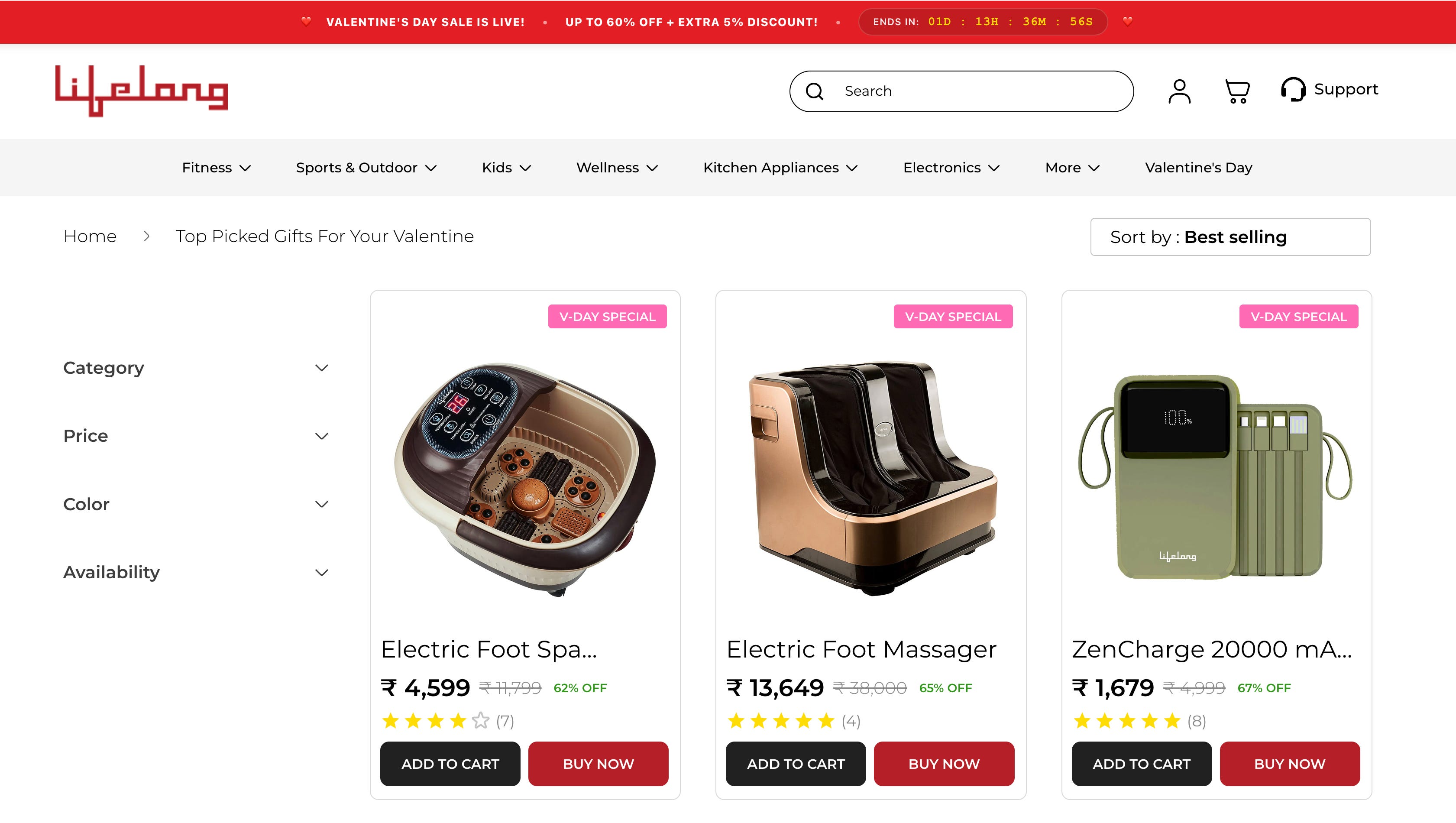
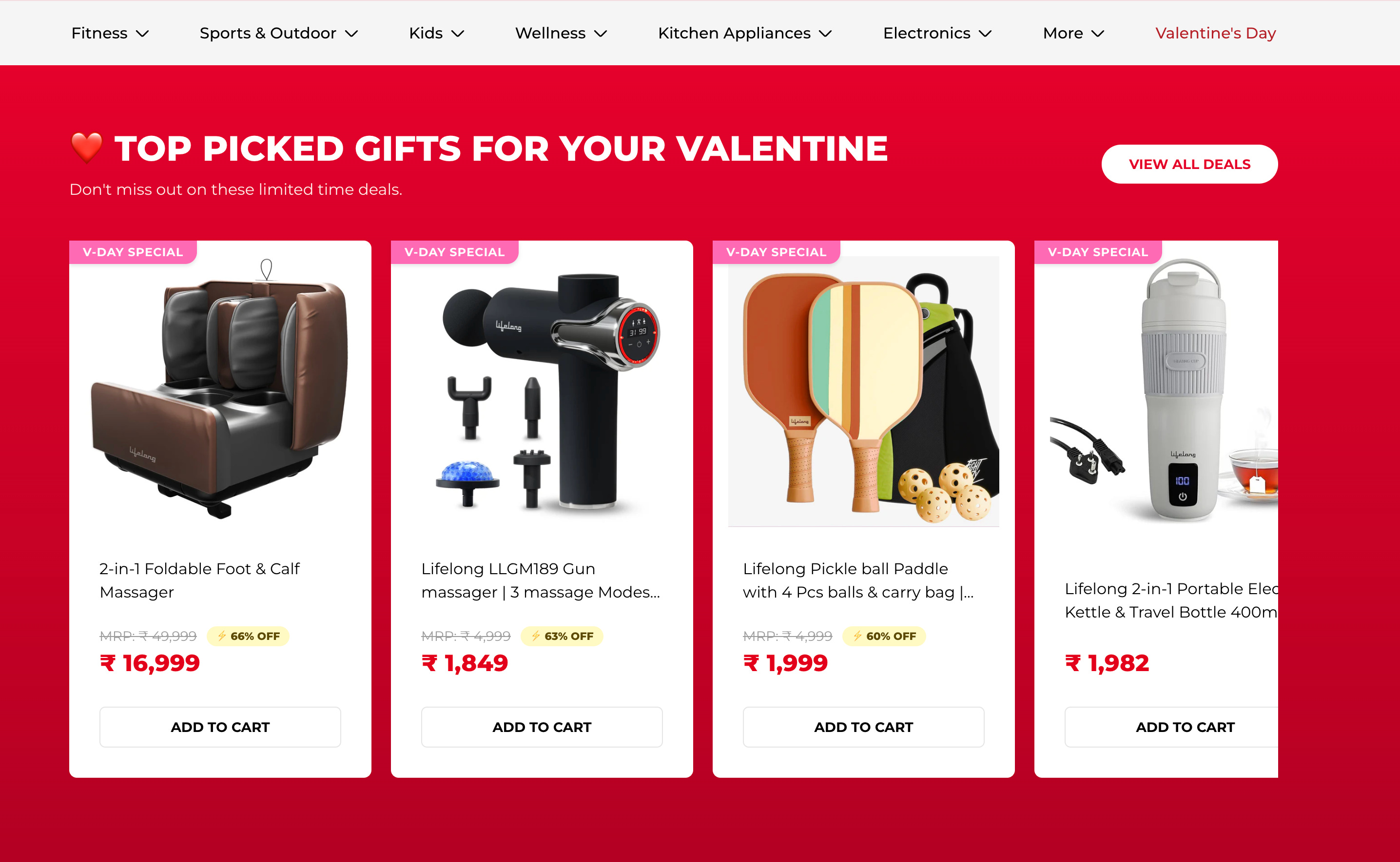
3) Shortlist layer: “Top Picked Gifts”
The landing page includes a clear module labeled “TOP PICKED GIFTS FOR YOUR VALENTINE”, paired with “Don’t miss out on these limited time deals” and a “View All Deals” pathway.
What this enables: a safe default path for shoppers who want quick, pre-filtered picks.
4) Continuity cues: product-card event tagging
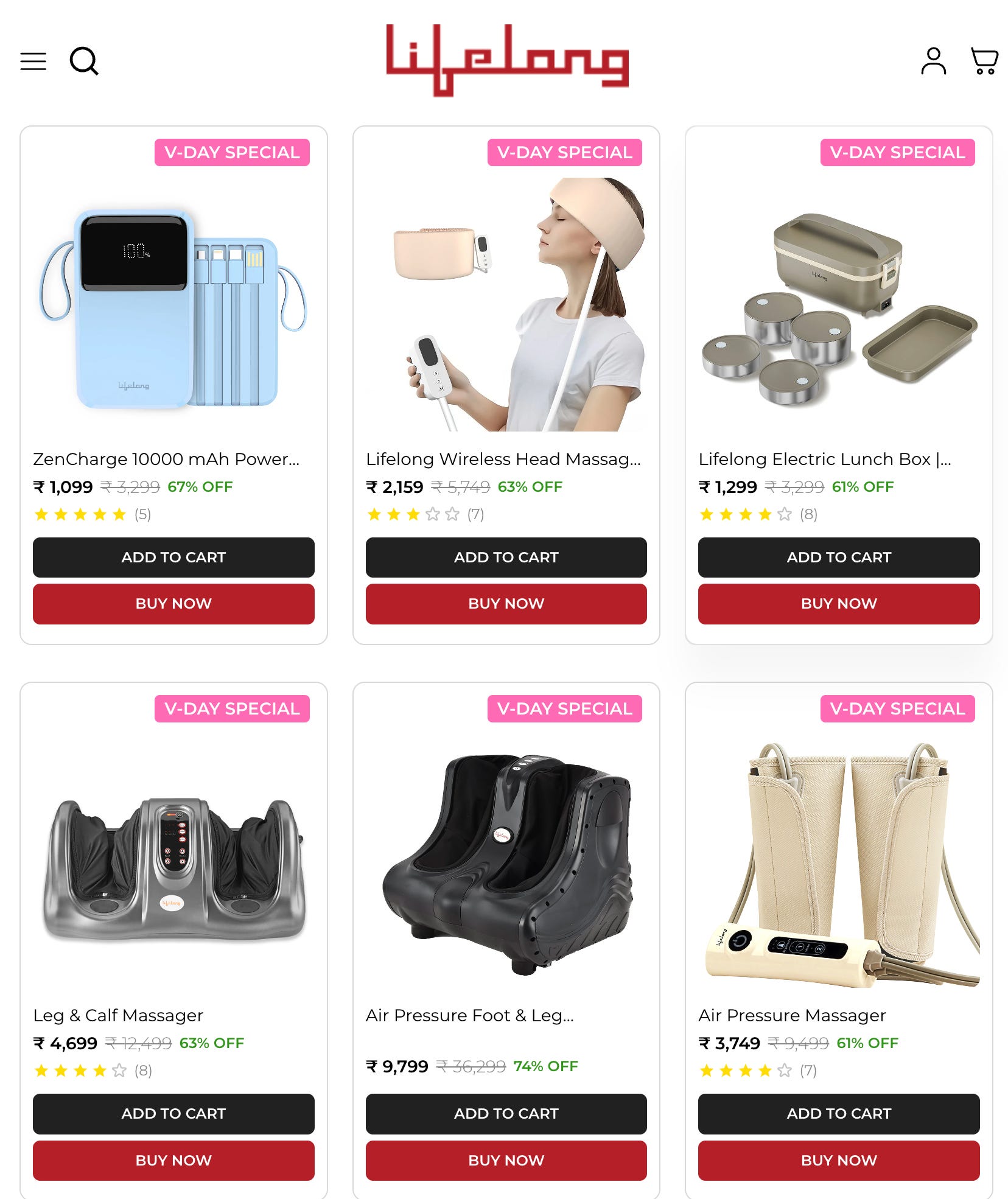
Products in the event merchandising set carry a repeated “V-DAY SPECIAL” label on the cards.
What this enables: relevance stays visible while the shopper scans, compares, and price-checks.
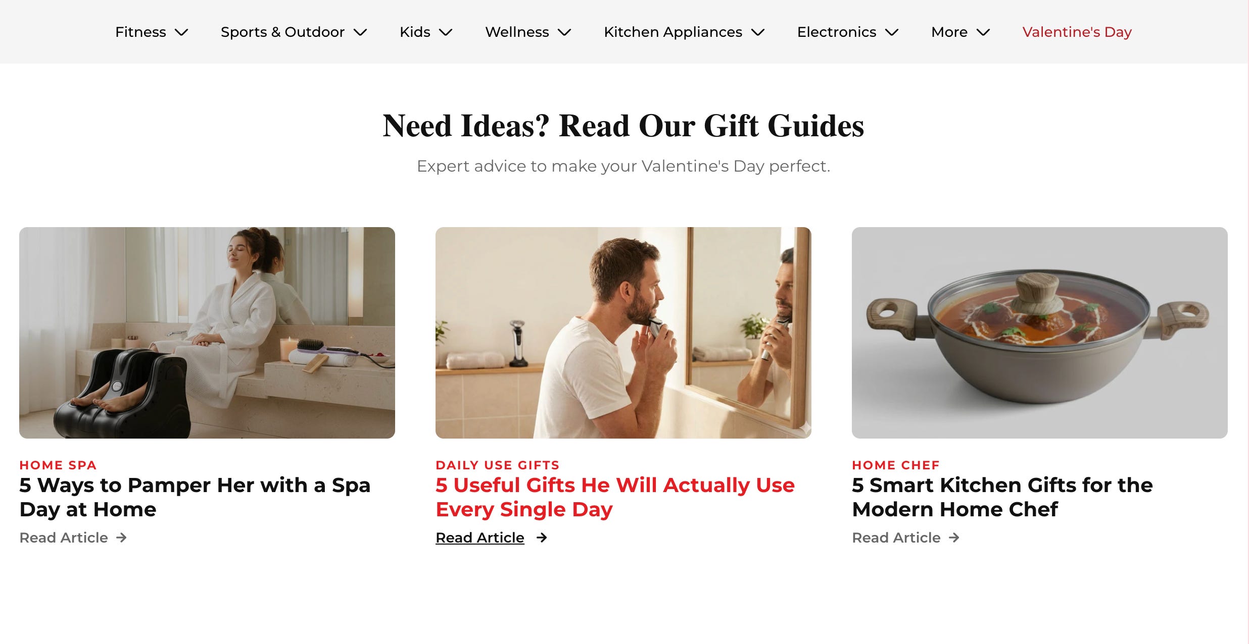
5) Content layer — gift guides for shoppers who need reassurance
What we shipped:
A section titled “Need Ideas? Read Our Gift Guides” with article links inside the Valentine hub.
Examples:
“5 Useful Gifts He Will Actually Use Every Single Day”
“5 Smart Kitchen Gifts for the Modern Home Chef”
Why this matters:
Gift buyers often hesitate because they’re optimizing for social outcome (“will this land well?”). Guides act as a confidence bridge: they give language, justification, and a short-list without forcing the shopper to do research elsewhere.
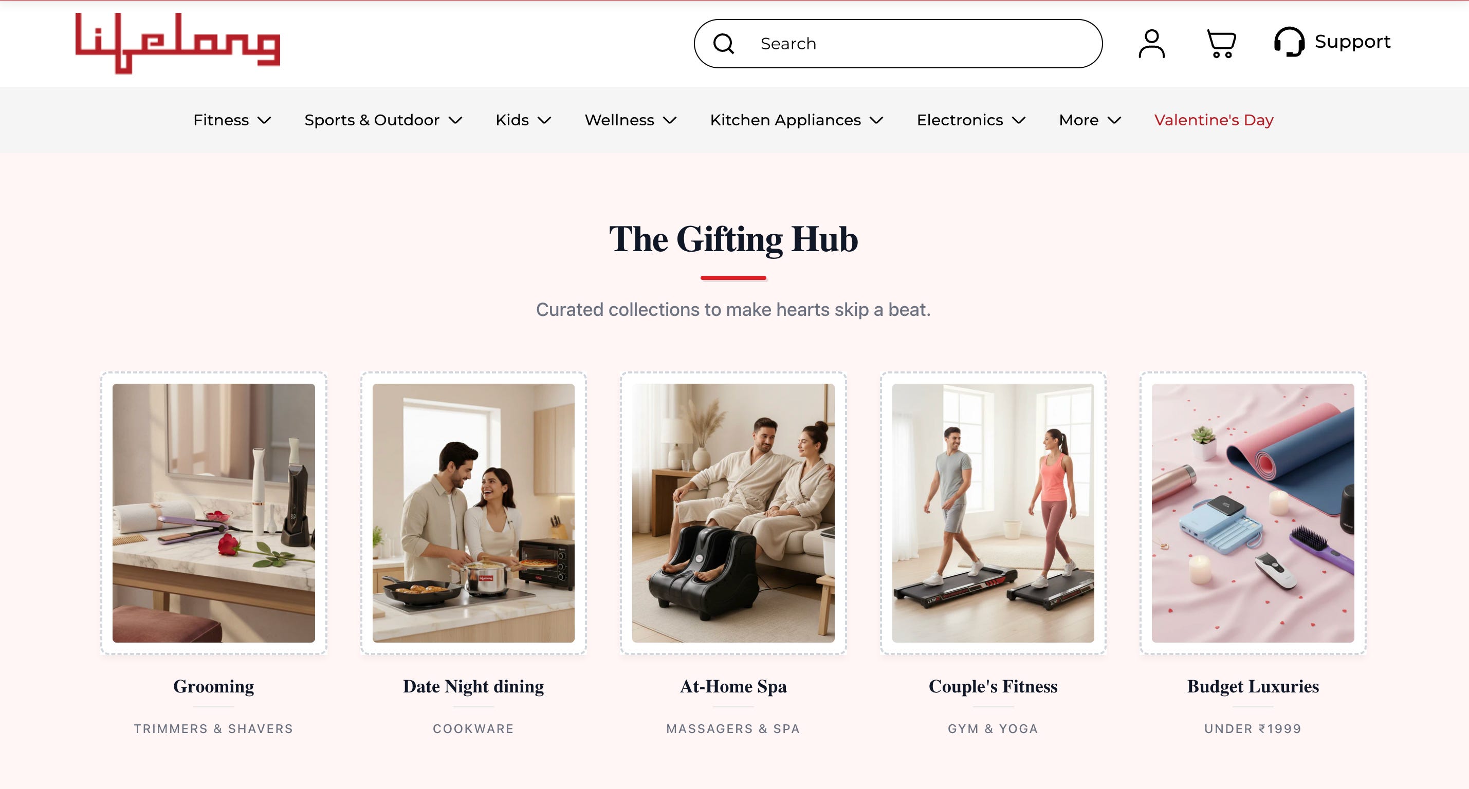
6) The Gifting Hub - 5 curated paths that map to gifting intent
A section titled “The Gifting Hub” with five curated tiles and clear sublabels:
Grooming (Trimmers & Shavers)
Date Night Dining (Cookware)
At-Home Spa (Massagers & Spa)
Couple’s Fitness (Gym & Yoga)
Budget Luxuries (Under ₹1999)
Why it works
Routing succeeds when it matches recognition, not recall. The shopper doesn’t need catalog knowledge. They only need to recognize a gifting scenario that fits.
What we executed:
Defined the 5 gifting missions.
Mapped each mission to a dedicated collection experience.
Ensured the tile UI looks editorial, so the shopper’s first interaction is value-driven, not warehouse-driven.
Results
Conversion lift within the Valentine window
The merchandising-led Valentine destination contributed to a conversion rate improvement of up to ~40%.
Why this pattern tends to move CVR
Shortlisting reduces decision effort early in the session.
Relevance cues reduce comparison friction during browsing.
Editorial support reduces uncertainty for gift buyers who stall.
Persistent offer context sustains urgency across scroll depth.
Lifelong improved conversion rate by up to ~40% during Valentine week by packaging the sale as a guided gifting journey: shortlist-first merchandising, visible event cues on product cards, and gift-guide support for uncertain shoppers.
Helium builds seasonal merchandising systems that convert deadline traffic into purchases through tighter routing, cleaner shortlists, and decision-support content that scales with speed.
Ready to build your next seasonal destination page with the same architecture?
Get in touch about guided merchandising and contextual discovery.